 I was having dinner last week with my good friend Martha, who is a very talented photographer, when she suggested that I do a post on sharpening in Lightroom. Yes, this is what instructors and photographers talk about at dinner, even after the wine is poured! Coincidentally, in the past week, two other readers have also asked for posts on how to sharpen in Lightroom.
Sharpening is intended to make edges in your photo look crisp. It can’t bring out-of-focus images into focus, but if your subject is in fact in focus, it can make it look significantly sharper. It does this by adding contrast to edges — that is, it brightens the bright side of an edge, and darkens the dark side. In essence it adds a very narrow shadow along an edge — and to our eye, shadows make things look more three dimensional.
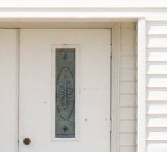
Here is a small part of an image (zoomed into 1:1), before sharpening, and then with Lightroom’s Develop module (capture) sharpening applied:
There are potentially three stages in the sharpening workflow:
- Capture Sharpening: every digital image (and every scan) is hazy, due to sensor/scan capture technology limitations. Capture sharpening is designed to punch through this haze. (You may not realize that your images are hazy, but when you compare before and after sharpening, you will begin to appreciate it. Capture sharpening is applied to your full size image, and is accomplished in the Detail panel in the Develop module. It is very important not to overdo this stage of sharpening, because it is just the first stage.
- Creative Sharpening: this is local sharpening — optionally applied to part of your image — to bring more attention to to that part. You have probably seen portraits of babies where the eyes have been sharpened to the point that they practically pop off the page. With Lightroom, creative sharpening is accomplished with the adjustment brush in the Develop module.
- Output Sharpening: this is size and medium dependent, and is accomplished in the Print, Book and Web modules, and in the Export dialog where you create JPEG and other copies. A large print needs significantly more sharpening than a small image to be viewed on the web; an image printed on matte paper needs more sharpening than one on glossy paper because the ink soaks into the former. Output sharpening takes into account resolution, medium, and how much interpolation has been performed.
There is no correct amount of sharpening — it is subjective. Put 10 experienced Lightroom users in front of an image, and there will be 10 significantly different settings chosen. If prints are your goal, the best way to learn is to do your sharpening and then print your images and look at the results from a reasonable viewing distance. Try prints of the same image with significantly different amounts of capture and output sharpening. If on-screen viewing is your goal (web or email sharing), also try different amounts of capture and output sharpening, and compare the images on-screen.
Capture Sharpening
How crisp the image appears is partly dependent on how light or dark the image is, how much contrast and clarity it has, etc, so I recommend that sharpening be the last step of your work in the Develop module. (If you sharpen and then for some reason need to make other changes, that is perfectly ok.)
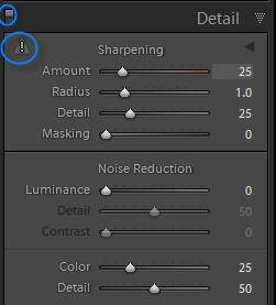
Here is a screen capture of the Detail panel, on the right towards the bottom in the Develop module:
The settings shown (Amount 25, etc.) are those for a raw file, before you do anything. Notice that by default, some sharpening is applied. No sharpening is applied to jpegs by default, because jpegs are often sharpened in camera (It depends on how you have set your camera settings). The Lightroom team therefore didn’t want to assume that these need more sharpening. Of course you can still choose to add more sharpening to your jpegs.
The little exclamation point to the left of the word Sharpening is a warning that you cannot see the effects of sharpening accurately unless you zoom in fully, to 1:1. Click on the exclamation point to do so. Now, to see the effects of your sharpening (and noise reduction) settings, toggle the Detail panel off and on by clicking on the little switch to the far left of the Detail panel title (also circled in the above snapshot). I would start with an area that is the most in focus, maybe the eyes in a portrait, and then move around in the image, continuing to turn the switch on and off.
There is a sideways triangle to the right of the word Sharpening that you can click on to see a small window of your image zoomed in to 1:1, but I don’t use this — I prefer to zoom in on the main image to 1:1. I collapse this window by clicking on the triangle.
How much sharpening is enough? Your goal should be to punch through the haze, without introducing obvious issues, like halos and artifacts (discussed below).
I will explain the four sliders, but rest assured, while you should attain a basic understanding of these, you don’t have to be an expert on the technical underpinnings. (I myself am not). Once I explain these, I will tell you what I recommend you do as you are getting started — it’s pretty straightforward.
Amount: how much contrast is added to edges — that is, how much the bright side of an edge is brightened, and how much the dark side is darkened.
Radius: how far out from the edge this effect happens. A radius of 3 indicates that the brightening and darkening goes out 3 pixels from the edge. A radius of around 1 is almost always going to be a good answer. A slightly smaller radius may be appropriate for an image with a lot of fine detail, like a landscape or a close up of a texture; a slightly higher one might be appropriate for a portrait, which because it has less fine detail, needs more along major edges.
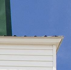
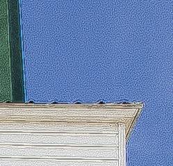
Here is a close-up with an extreme Amount (150), and an extreme Radius (3.0). You can see at the edge of the steeple that the bright side (the sky) has been brightened a lot, and the dark side (the steeple) has been darkened. Along the white edge of the building, the sky is the dark side, so it has been darkened, and the white side has been brightened.
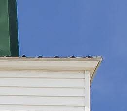
When I leave the Amount the same, but reduce the Radius to 1, notice how the brightening/darkening is the same, but that it now only goes out 1 pixel from the edges:
The goal with sharpening is to make the edges appear crisper without leaving obvious halos or artifacts. In the above image, your eye is immediately drawn to the bright line at the edge of the steeple — that is a halo. Notice also all the noise brought out in the sky and along the white siding — those are artifacts.
Here is the image with the Amount reduced to a more reasonable 60.
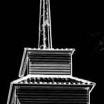
It’s a little hard to see in this snapshot, but even with an amount of 60, the sharpening is bringing out noise (specks) in the sky and in the smooth siding. (If you can’t see it, look at image 2.) When you see this issue, it would be ideal to be able to tell Lightroom not to apply sharpening to low contrast, or smoother, areas in the image. Of course we can — with the Masking slider. The higher the Masking setting, the more sharpening is restricted to obvious edges. If you hold the alt/option key down as you slide it, you will be able to see what is affected. What is white is sharpened, what is black is not:
Let’s go back to Amount 150, with the Masking set at 60, just to make it obvious that the sky is now unaffected. Compare this one to image 2 above. Notice how in this one, noise in the sky and other smooth areas is not sharpened.
Another example of where a high masking setting is usually called for with a portrait, where you don’t want to bring out every pore and fine hair on a face.
Detail controls how much of the fine detail, or high frequency information is a candidate for sharpening. Here it is with Detail at 100 (and Masking back to zero):
Generally, low settings are appropriate, hence the default of 25. To bring out more fine detail, increase it, to focus more on major edges, decrease it.
Note that you can hold down the alt/option key as you slide any of the four sliders, and you will see a black and white rendition of what is affected. I find this functionality most useful with masking.
Ok, so now that I have dutifully explained all the settings, what should you actually do if you are just starting out?
Lightroom comes with two useful sharpening presets. (Presets are just saved combinations of settings.) In the Lightroom Presets section of the Presets panel on the left, towards the bottom, you will see:
I use the Scenic one for landscapes and architectural shots. The settings are Amount 40, Radius 0.8, Detail 35, Masking 0. The settings for Faces are Amount 35, Radius 1.4, Detail 15, Masking 60. This makes sense — with portraits you don’t want to sharpen as much of the fine detail, and you want to mask off much of the face.
Here’s what I recommend:
1. Click on one of the presets.
2. Zoom into 1:1 on an important in-focus area.
3. Hit the Detail panel switch off and on to see how well the preset works.
4. Adjust the Amount to taste — usually I find the Faces preset to be too conservative. My experience with the Scenic one is more mixed.
5. Pan around the image to assess how your decision in (4) affects other parts, hitting the switch on and off to understand what has happened.
6. Adjust Masking (as explained above) if you see issues caused by sharpening being applied to smoother areas. I find that I often have to increase masking on portraits from 60 to 70 to reduce wrinkle and pore accentuation, and that I have to add masking to landscapes with a lot of sky.
It is not very often that I change the Radius and Detail settings from what is in the presets — but do start to experiment with these as you get more comfortable.
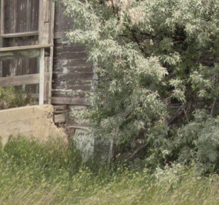
Here’s a close-up of part of an old building in a field:
When I panned around the image, I did see some artifacts in some of the smooth areas. Masking of 20 protected these areas:
Finally, let me just show you what TOO MUCH sharpening looks like for an image like this:
The leaves and the grass blades all have halos around them, and a lot of noise has been brought out and artifacts have been introduced, most noticeably in the smooth wood of the building. Occasionally when I go to a photography show at a gallery, my first reaction isn’t “What great/horrible photographs!”, but rather “Wow, too much sharpening!” When in doubt, be conservative. A little is better than nothing, and too much is a disaster.
So that’s capture sharpening — the first stage in the sharpening workflow. In the next post on sharpening I will discuss how to do creative local sharpening with the adjustment brush.
Now that you have completed this lesson on sharpening, do check out Martha’s fabulous maternity, newborn and child photography at www.mlarsonphoto.com! Then come back and read more posts or check out my Lightroom DVD.

