I wrote about the importance of exposing as brightly as possible, short of blowing out important highlights in my post “What Lurks in the Shadows: The Case of the Black Cat“. I encourage you to read it if you haven’t.
I thought I would show you an example of a perfect exposure that in fact looks terrible in-camera.
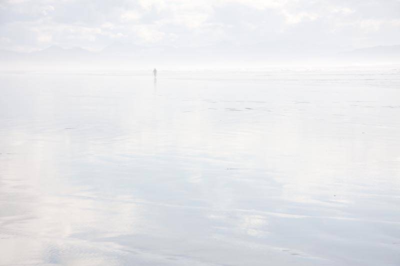
Here is a photograph I took on the Oregon Coast:

The Beach — As Shot
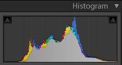
And here is the histogram:

A Perfect Exposure
I nailed the exposure on this one — the histogram is as far to the right as possible without anything being blown out. But on the back of the camera the shot looks terrible!
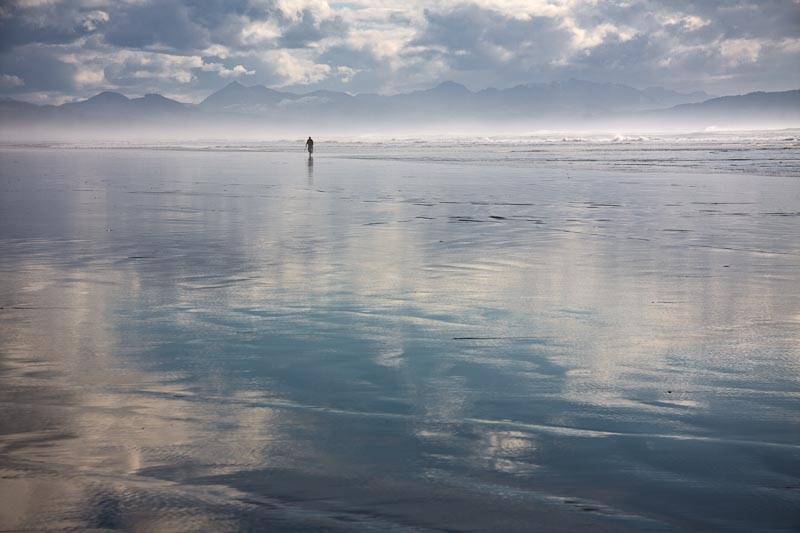
Of course I didn’t worry, because I knew that I captured very high quality information in that right side of the histogram, and I can add lots of contrast and darken the image without worrying about noise and other data issues. Simply spending 30 seconds on the image in Lightroom, bringing the blacks slider to the right, adding a ton of contrast and reducing brightness gave me this:

The Beach After a Few Adjustments

Histogram after Processing
The bottom line: if you try to darken something that is too bright, you will find that the image holds up quite well. If instead you try to brighten something that you have underexposed, you will find that noise that lurks in the shadows, as I show in my Cat post.
Do try this at home!
UPDATE: A reader asked me if I would show how I developed this image. Click here for a video demonstration of how I developed it. (This was developed using Lightroom 3.)
[sc:signup]

Aha! Thanks. Seems to work shooting towards the sun.
Great information in this post! I have always learned to shoot to the right (without blowing anything out) to retain the most information in the picture.
The first picture (histogram to the right) has an awesome effect to it though. I really like both shots though — good work!
It would be interesting to tell us what adjustments you did between exposure – brightness -black – tone curve.
Thanks !
[…] also my follow up post: The Perfect Exposure ▶ View 4 Comments /* 0) { jQuery('#comments').show('', change_location()); […]
[…] an Image in Lightroom In Uncategorized on February 8, 2010 at 2:26 pm A few months back I did a post on exposure — in particular, on the importance of exposing an image to the right, i.e. as brightly as […]
I have a new post/video showing how I enhanced this image:
http://digitaldailydose.wordpress.com/2010/02/08/video-developing-an-image-in-lightroom/
Hi Laura
Thank you for both this and your video which is how I found you blog in the first place.
I have a question though!
I have tried to adopt this technique for a long time now but every now and then I find myself in a situation where the dynamic range is too high and I don’t have time for any sort of HDR because things are moving too quickly. Which is more important in your opinion: preserving highlights or reducing noise in shadows.
An example. I shoot equestrian events and my subject is jumping a fence in front of me on a white horse in bright sunshine. I want to keep the details in both the horses coat but also reduce noise in the shadows cast my the sun. Even if I manually select my exposure I get some clipping at both ends. Do I just have to make a decision as to which part of the image is more important? I obviously can’t take two identical shots with different exposures and blend!
What would be your thoughts?
Thank you for your comment, Nico. You’re exactly right — it is a trade off and you have to decide which is more important based on the subject of your photograph. If you are shooting in Raw, you can recover some blown out highlights using the Recovery slider in LR or ACR, so you will still get good results if you overexpose a little bit (how much can be recovered will depend on your camera). Note that noise in the shadows is going to be most obvious if you have to brighten them, so if the shadows are what is most important, at a minimum be careful to not underexpose them (based on what is visually correct). All this adds up to erring on the side of overexposure rather than underexposure.
[…] photography (also known as ETTR), What Lurks in the Shadows: The Case of the Black Cat and The Perfect Exposure, Or, When Things Don’t Look So Good. In the second one, I show you an example of where I nail my exposure — the photograph […]