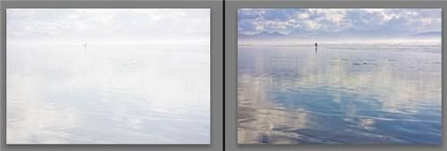
I hope you aren’t disappointed when you read this, but truly, the most important thing you can do to get great results in Lightroom’s Develop module is to master the Basics panel. It can get you all or most of the way to a stunning photo.
Note: This article was written for Lightroom 3. For Lightroom 4+, see this post to learn its much different Basic workflow.
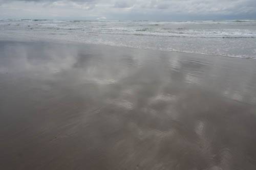
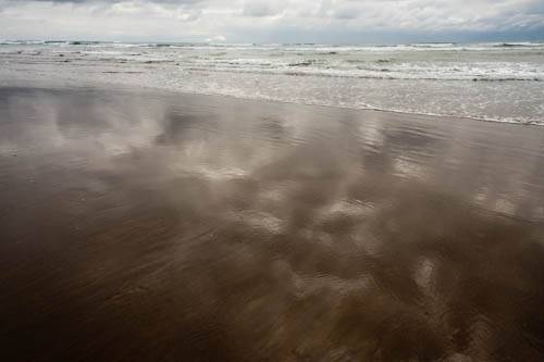
I am going to work through the photo below to illustrate the use of the panel. The photo is dull and flat — the bright tones aren’t very bright, the dark tones aren’t very dark, it doesn’t have much color, and it doesn’t feel very three dimensional. The photo is a raw file — the specific settings I discuss below would be different for a jpeg — but this post isn’t really about recommending specific settings — it is about learning how to think through what to do with the Basics panel.
1. Use the temperature and tint sliders to change the overall white balance (color cast) of the photo.
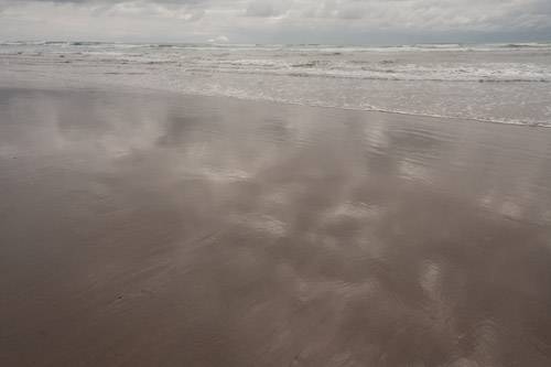
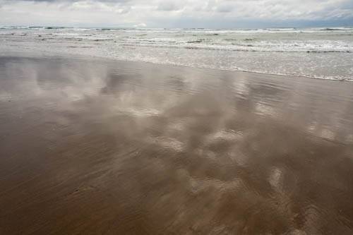
This image feels a bit blue to me — it was shot on a cloudy day, with no white balance compensation in camera. I will therefore slide the temp slider away from blue a little ways towards yellow. With this kind of photo, I am going for what I like, rather than what is technically accurate. (Read more on white balance here.)
If you aren’t sure what would look good, experiment with the Temp and Tint sliders — subtle changes are usually best.
If the photo is too dark or light at this point to make a judgment on white balance, this can be done later.
2. Set Exposure for how bright you want the brightest tones in your photo to be.
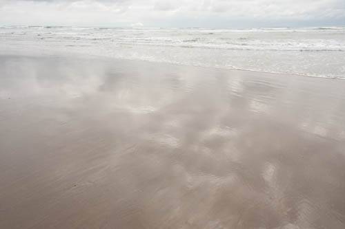
Looking at the Before photo above, you can see that the brightest tones (the whites of the waves, the highlights in the clouds) are not very bright. I will increase Exposure, focusing on how bright these areas are (and ignoring if the rest of the image gets too bright). I will keep an eye on the histogram, to make sure that I am not unintentionally blowing out the highlights. Here I increased Exposure by 1 stop:
If instead, you have a photo with blown out highlights, and the overall the photo is too bright, reduce Exposure to restore detail to the highlights. If on the other hand the overall photo isn’t too bright, rather than use Exposure, use Recovery to recover the blown out highlights.
3. Set Blacks for how dark you want the darkest tones in your photo to be.
Often photos look great with a lot of contrast — i.e. with the dark tones being very dark (but not so dark that they have lost detail), and the light tones being very light. This is not always the case though — go by how the photo looks to you.
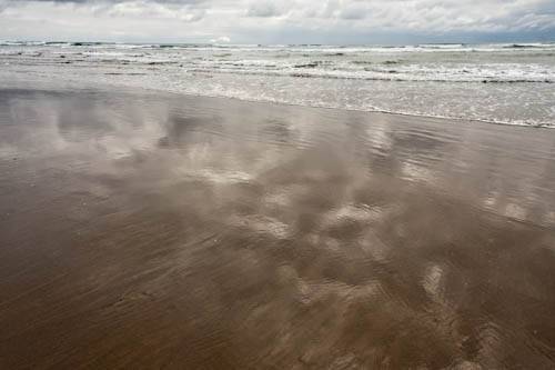
Here I increased Blacks by 40:
Blacks +40 to Darken the Darkest Tones
4. If the photo overall is now too bright or dark, use Brightness.
Brightness will adjust the midtones — leaving the brightest and darkest tones that you set with Exposure and Blacks pretty much protected.
5. To adjust the overall punchiness of the photo, adjust Contrast.
Contrast brightens the light tones and darkens the dark tones, so if you find that overall it makes the photo too dark or light, go back and adjust Brightness to compensate.
I want the photo to be a bit darker and punchier to increase the moodiness of it, so I decrease Brightness from 25 to 10, and increase Contrast from 50 to 75:
6. Use Fill Light at any point to add light into the shadows.
In this photo, my work so far has darkened the shadows (the sand at the bottom of the photo too much. 20 points of Fill Light brightens this up nicely:
7. Add clarity to add make edges in your photo appear more three dimensional.
Clarity adds contrast to edges — it darkens the dark side of each edge and brightens the bright side — to fool our eye into believing they are more three-dimensional. One sign of going too far with clarity is that you end up with very obvious shadows along edges. Watch for this. It isn’t an issue with this photo.
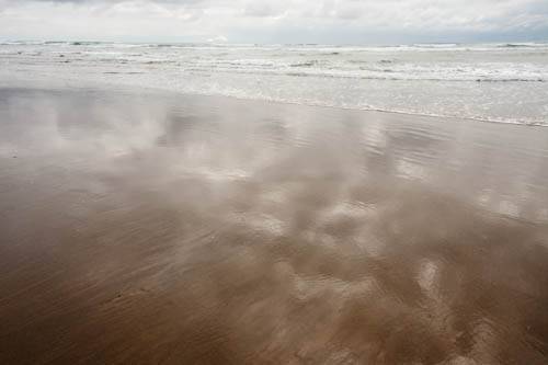
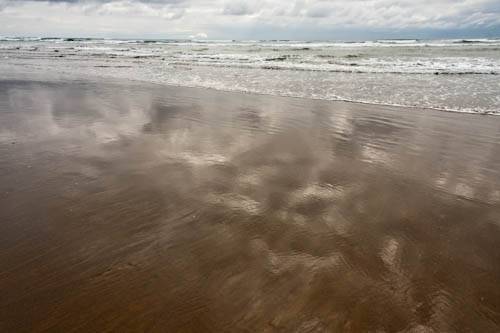
Not only does +80 of Clarity make the waves more three dimensional, but it also pops out the reflections and textures in the sand:
8. Adjust vibrance and/or saturation to increase or reduce the intensity of colors.
Saturation adjusts all colors equally, while vibrance focuses on the less-intense colors that need more of a boost, and also protects skin tones. (Read more on the difference between vibrance and saturation here.) Contrast can have a side effect of increasing saturation, so sometimes I end up decreasing it at this point.
In a photo like this one, I experiment to find the combination I like most. I found that +45 on Saturation and -25 on Vibrance gave me a bit more of a boost in the blues and greens and allowed me to hold back the yellow in the sand. The change is admittedly subtle:
That’s it for this photo — the Basics panel took us a tremendous distance in making this a stunning photo (at least to my taste — you might choose to interpret the photo very differently from me!). From here I would consider doing some local work. For example, I find some of the bright highlights of reflection at the very bottom of the photo to be a bit distracting — I would darken these with the adjustment brush, and maybe some of the clouds as well. I would then move onto sharpening, in the Detail panel.
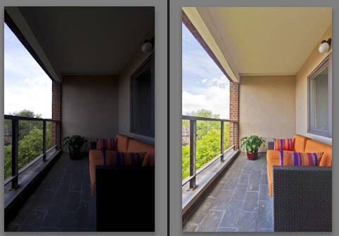
Here are two more photos enhanced with just the Basics panel, using the method outlined above:
Watch the video on developing the above beach scene for Basic panel work plus much more.
The results in these cases are dramatic, but often photos don’t need this much adjustment. Give it a try!
[sc:signup]
