Last week Lightroom guru Sean McCormack released a new web engine plug-in, LRB Exhibition. I have to say, I am impressed — in less than an hour I was able to use Lightroom to create a complete website that I would not hesitate to show someone who might judge my work. The plug-in accomodates a home page, about page, contact page, one additional page of your choice, up to two external link pages, and up to 6 gallery pages. You can modify text placement, fonts, all colors, and much more. And it costs just 15 Euros, or USD $21 at today’s exchange rate! This includes up to 9 downloads, so as Sean continues to refine the product, you can get 8 upgrades before having to repurchase. Some users will want even more flexibility than the product currently has, and perhaps more will get built into it, but as it is I consider it quite a deal. UPDATE: Sean is offering a 20% off introductory price through Friday night (2/12, Ireland time).
Here is my sample website (with just a random sample of photos): www.laurashoe.com/LRB_Exhibition
You can read about the plug-in, watch a video, see sample galleries and purchase the plug-in HERE
If you buy it, do watch the video; then plan to spend some time experimenting to figure out some of the details. Post questions for Sean on the product web page if you have issues, can’t figure something out, or want to make suggestions for future releases.
A couple hints from my experience:
Once you choose the size of your photos in the Appearance panel, crop all your photos to be of proportions to exactly fit this size — otherwise you will end up with some photos that don’t fill the width of the web page. I chose 900×600 for my photos. Therefore, I selected all my photos, went to Develop, turned on Auto-Sync (ctl/cmd-click on Sync), clicked on the crop tool, and in the Aspect Ratio section chose 2×3 proportions and hit Enter to commit the crop. Then I turned off Auto-Sync (ctl/cmd-click on Sync), and reviewed the crop on each photo to review and change what portion of the image might be cropped out, if any.
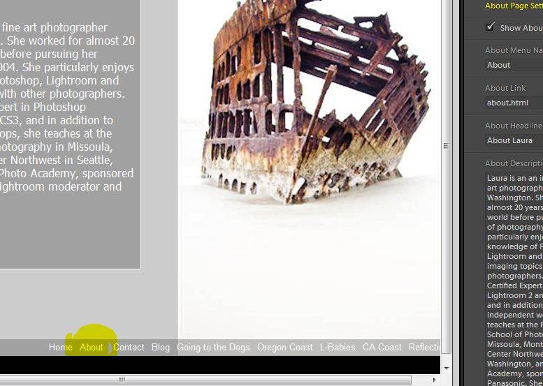
It may be obvious to most, but as I worked on the Home page, I saw what I was doing previewed in the Preview window. However, as I started working on the next page (About), this wasn’t previewed in the window … and the same was true for all the other windows. I was flying blind until I finally realized that to see the page in the Preview window, I needed to click on it in the menu bar:
Don’t consider yourself limited by my design — you will come up with a fantastic one of your own, I am sure… check it out!

